In what way does your media product use, develop or challenge forms and conventions of real media products?
My media product was a music video which accompanied the song The Girl by City And Colour. The song is about a man who is singing to his lover, who he seems to constantly take for granted, which is a common theme throughout the history of music.
My music video is a narrative. It presents the story of a boy who is more interested in spending time with his friends then with his girlfriend. This eventually becomes too much for his girlfriend who then decides to finish their relationship. There are some scenes of the boy contemplating his actions and a sense of time passing, and when he eventually comes to collect his things from his girlfriend’s house, he realises how much of a mistake he has made. The story is resolved when the boy calls his girlfriend to apologise, and they make up with a kiss.
This fits in very well with the normal conventions of music videos. There are many narrative examples of stories which are similar to this. For example, Fall For You by Secondhand Serenade (http://www.youtube.com/watch?v=5Mb8k8lfkmc).
There is also a lot of close up shots of the singer, and his instrument, which is an extremely common occurrence in music videos. Here is an example where instruments are the focus of the music video – Focker by Late Of The Pier (http://www.youtube.com/watch?v=cz5Dei5O3xY).
How effective is the combination of your main product and your ancillary texts?
My main product is set in a variety of locations, meaning that there are many themes I can link it to. The album cover is a still taken from the actual music video, meaning that the combination of the two effectively creates a matching product. The still also reflects the theme of the album, which is love. The back of the album cover is very vintage – it has a grey, vintage pattern as a background, with a vintage style text with the song titles. This reflects the sound produced by the band – they are typically an indie pop band, with a one off acoustic track. Both genres are suited to the vintage feel, as our target market are trendy young people, who will appreciate the look and feel of this album cover.
The inside of the album is an image of the bands central instrument – The MicroKORG. This product was designed to look and feel vintage, with a modern kick, hence why the side panels are made from wood, and the keyboard itself boasts grey colours, however, there is a kick of vibrant red lights, and fun sized keys which give the product a fresh, modern feel. This was a perfect image to include in the album cover, as it basically sums up our target market – modern people with vintage tastes; and it also congregates with the front and back covers of the album.
What have you learnt from your audience feedback?
I have screened my music video to two different sets of audience. The first screening was of my rough cut, which helped me develop my rough cut into the final product. The group delivered some constructive feedback, which I was able to include in the final cut.
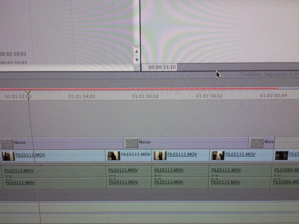
The main thing which concerned the audience was the length of some of the clips in the beginning – they felt that some were too long. To resolve this issue, I reshot some of the earlier clips and cut up the longer clips, creating a variety of angles in the same clip.
The audience were also concerned with my ending, as there was no resolution to the problems between the couple in the narrative; they simply went their own ways, much to the displeasure of the audience. After a long thought, I came up with a new ending and decided that the couple should rekindle their love, thus giving the video a happy ending.
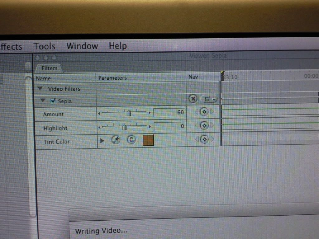
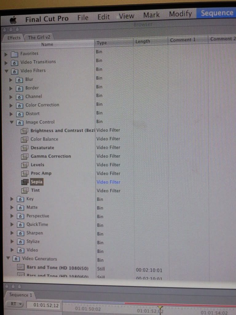
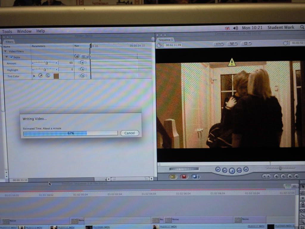
There was also a concern with the lighting and contrast in a few of the clips – they were either to dark, or too lights, so I decided to take each individual clip and edit it so that there was a smooth consistency throughout the entire video. I then proceeded to add a blue tint to the whole video, giving it a reminiscent feel, in the hope that the audience will feel like it is the character in the videos memories, and he/she is looking back on the past.
The second audience who viewed my final cut thoroughly appreciated the changed I had made to the video – they felt it had a much smoother consistency, and they really got to grips with the narrative of the song without being bored by seemingly endless clips.
How did you use new media technologies in the construction and research, planning and evaluation stages?
(to be continued)
Adorno & Horkheimer
6 years ago


